MWG©
I’m Maurizio William Guglielmi a multidisciplinary designer based in Milan, Italy. I specialize in a wide range of areas, from print and packaging to identity systems and illustration. I have a strong passion for typography, motion graphics, and UX/UI. My approach to design is all about challenging the norm to create bold, distinctive work.
I'm available for freelance opportunities and new projects.

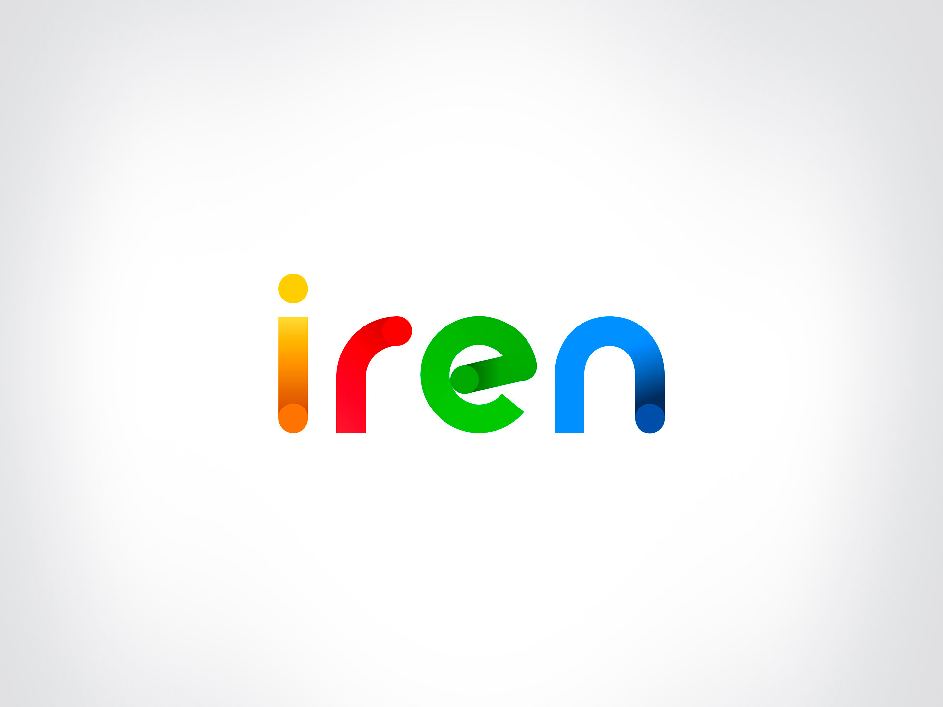
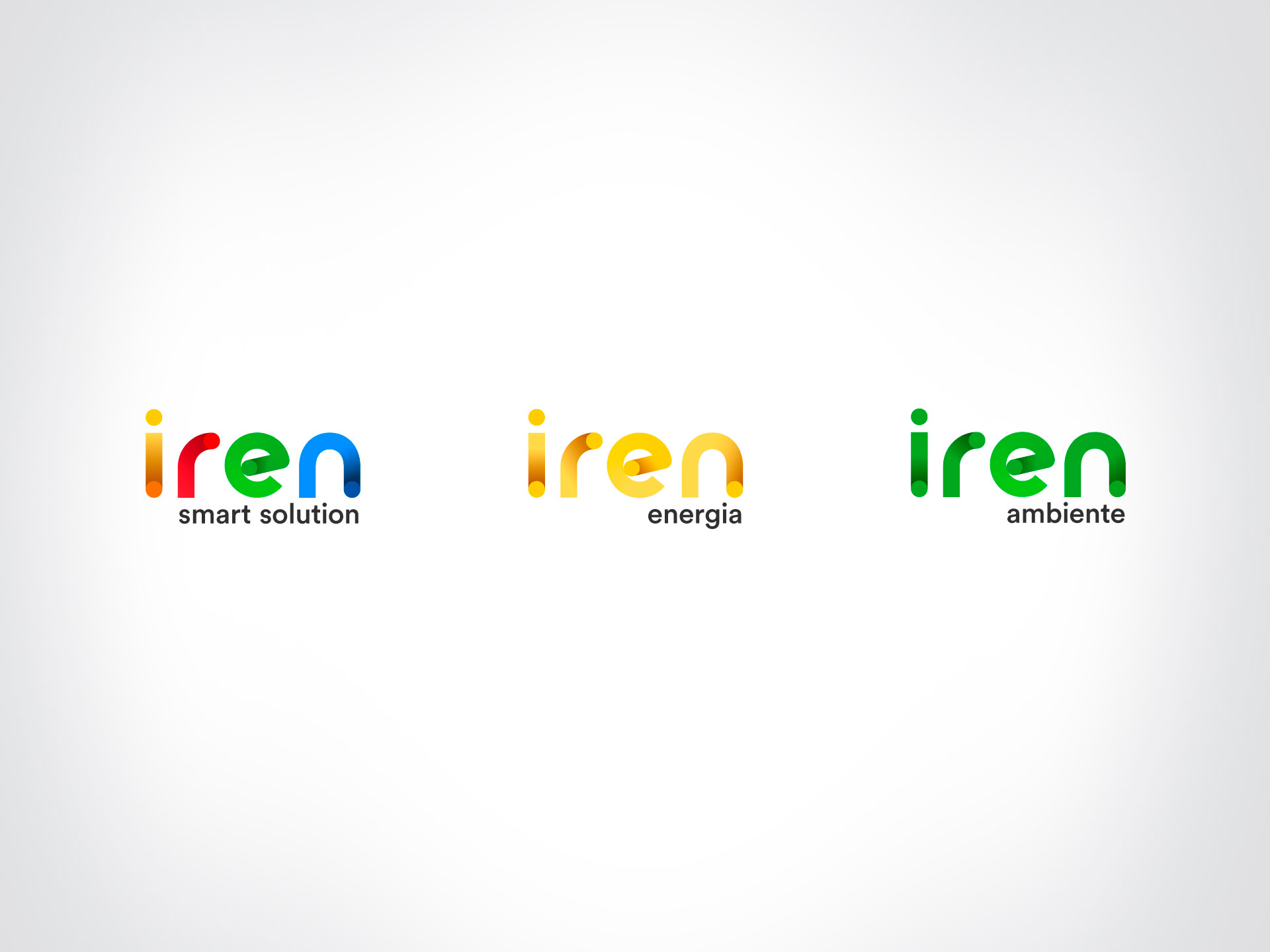
Iren
We redesigned the Iren coordinated image starting from its 5 circles, symbolising the five areas of multiutility company, to rewrite the logotype and to communicate dynamism and energy in motion.
Studio: LEAGAS DELANEY
Year: 2020
︎ Identity + Logo Animation