MWG©
I’m Maurizio William Guglielmi a multidisciplinary designer based in Milan, Italy. I specialize in a wide range of areas, from print and packaging to identity systems and illustration. I have a strong passion for typography, motion graphics, and UX/UI. My approach to design is all about challenging the norm to create bold, distinctive work.
I'm available for freelance opportunities and new projects.

BADA DOVE METTI I PIEDI
“Bada dove metti i piedi” is a botanical pét-nat style non-alcoholic fermented beverage developed for fine dining. The project brings the raw, angular character of the Murgia territory into a gastronomic context, deliberately avoiding any softened or “healthy” kombucha codes. The illustration forms a compact graphic mass merging hand, feet and wild botanicals into a single bold sign, not descriptive, but symbolic. A high-contrast palette and dominant black shape create strong shelf presence and reinforce the product’s uncompromising identity. Typography works structurally within the composition, with the naming treated as a graphic element rather than pure information.
The result is a label that introduces a more territorial and assertive voice into fine dining.
Agency: MWG©
Year: 2026
︎ Identity ︎ Logo ︎ Packaging


VIBEZ KOMBUCHA
Vibez is a naturally fermented kombucha designed for everyday moments, from lunch breaks to aperitivo or a train ride with headphones on. The visual identity moves away from the typical “natural kombucha” aesthetic, embracing the bold language of contemporary beverage culture and positioning the product as a confident alcohol-free choice. Oversized typography dominates the can, building immediate recognition and strong shelf presence. A vibrant color system differentiates flavors, while fluid graphic shapes introduce rhythm and movement. The result is a bright, dynamic can system that frames kombucha as a deliberate and contemporary alcohol-free option.
Agency: MWG©
Year: 2026
︎ Identity ︎ Logo ︎ Packaging


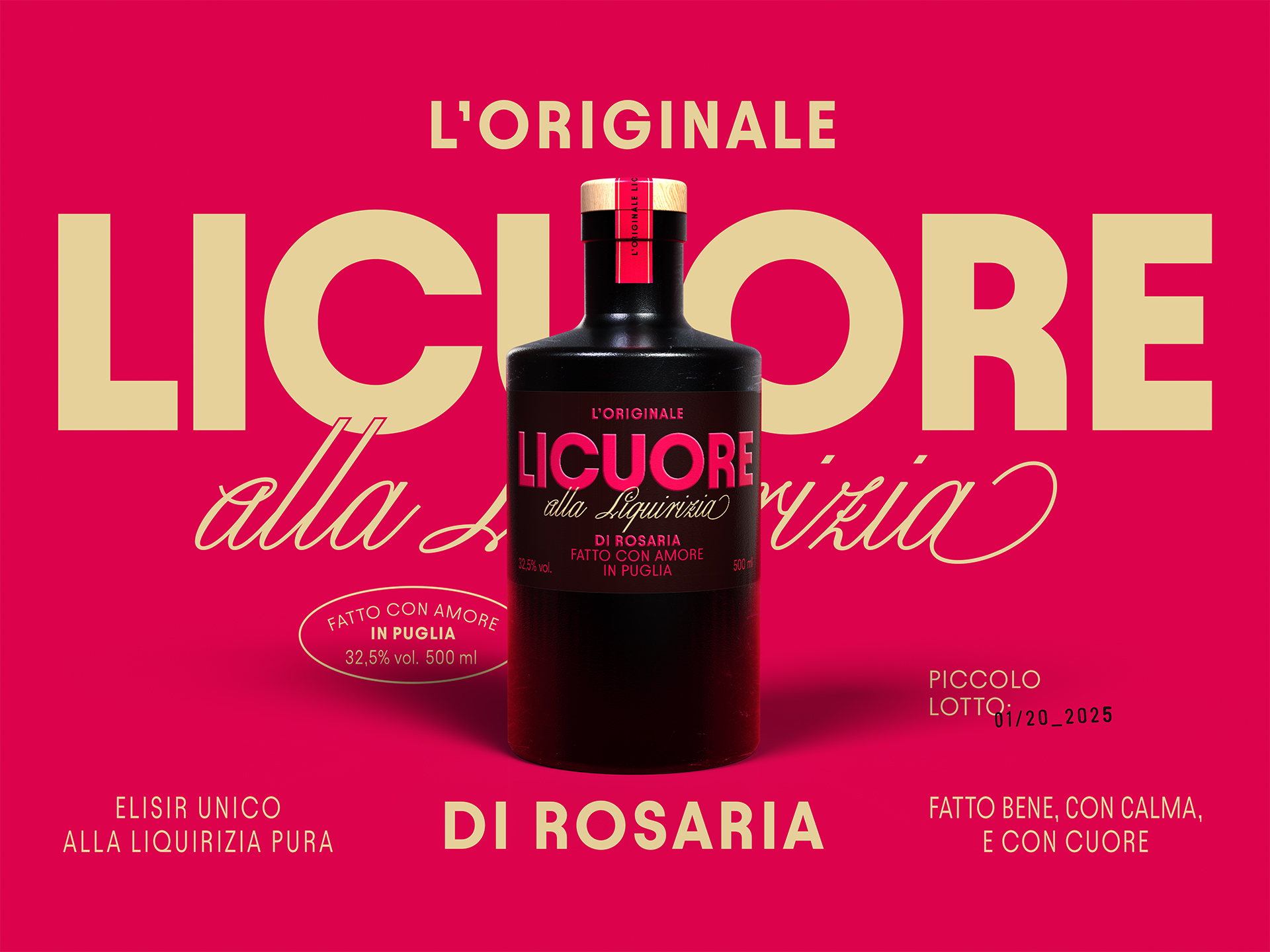
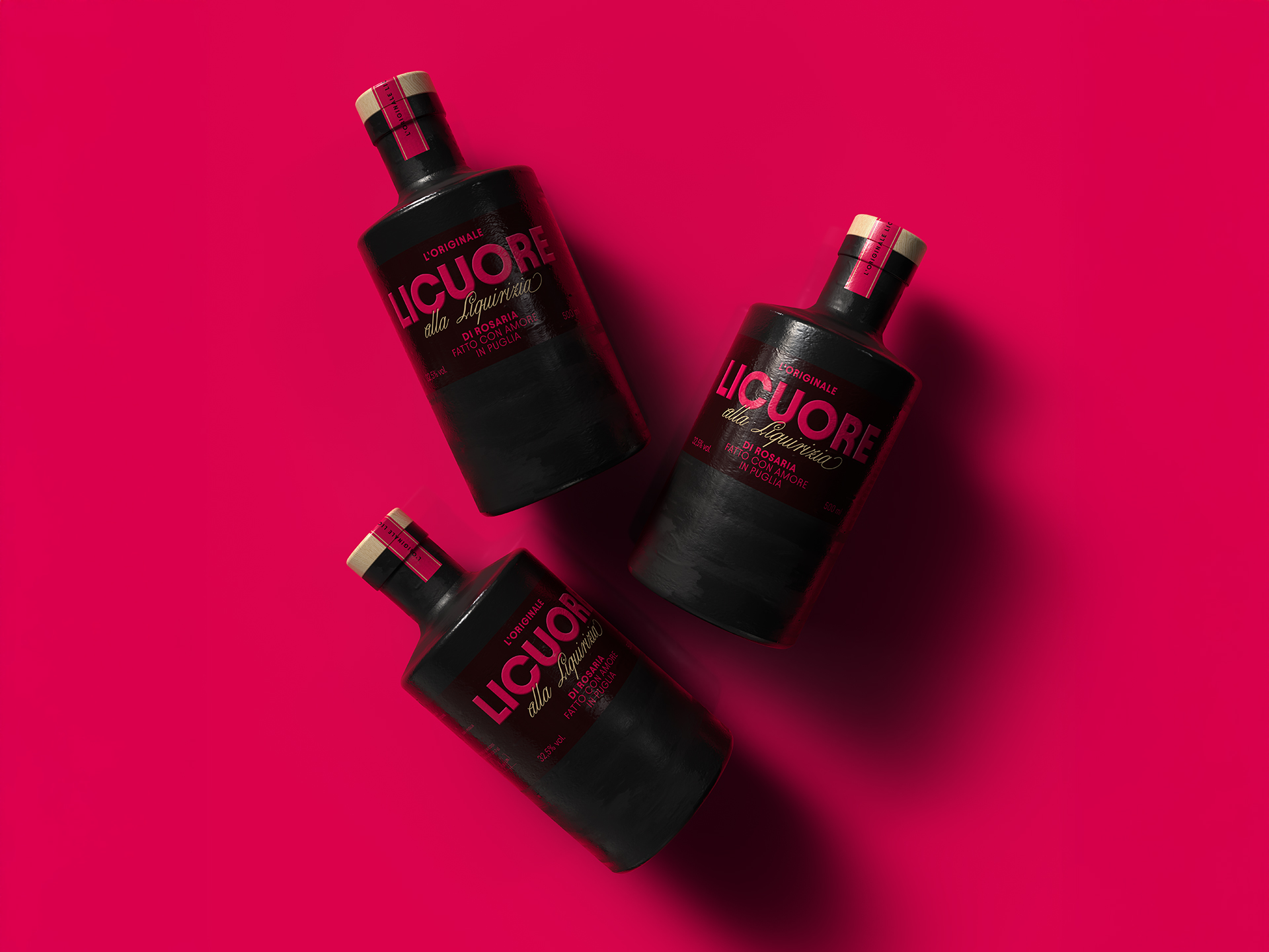
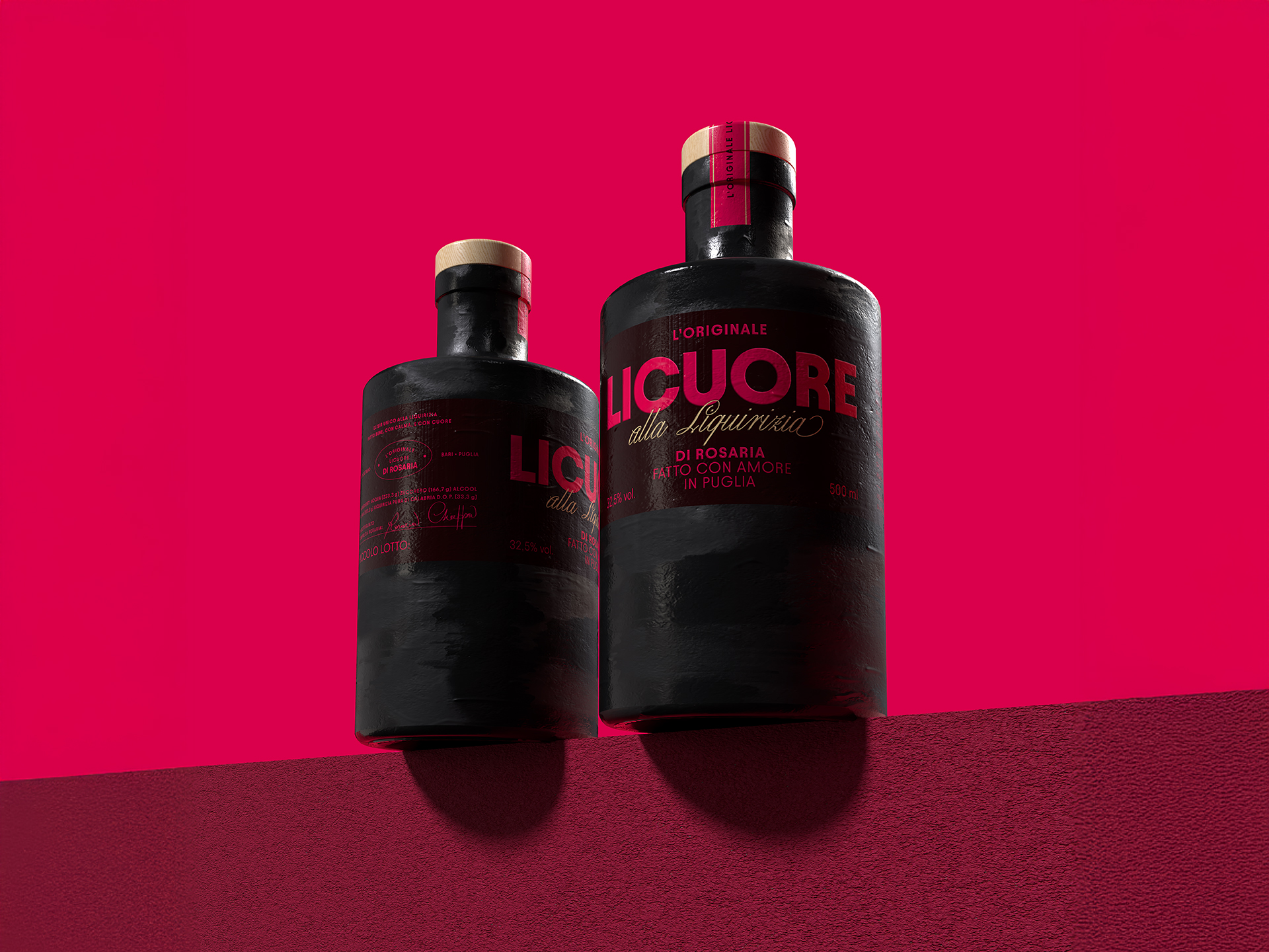
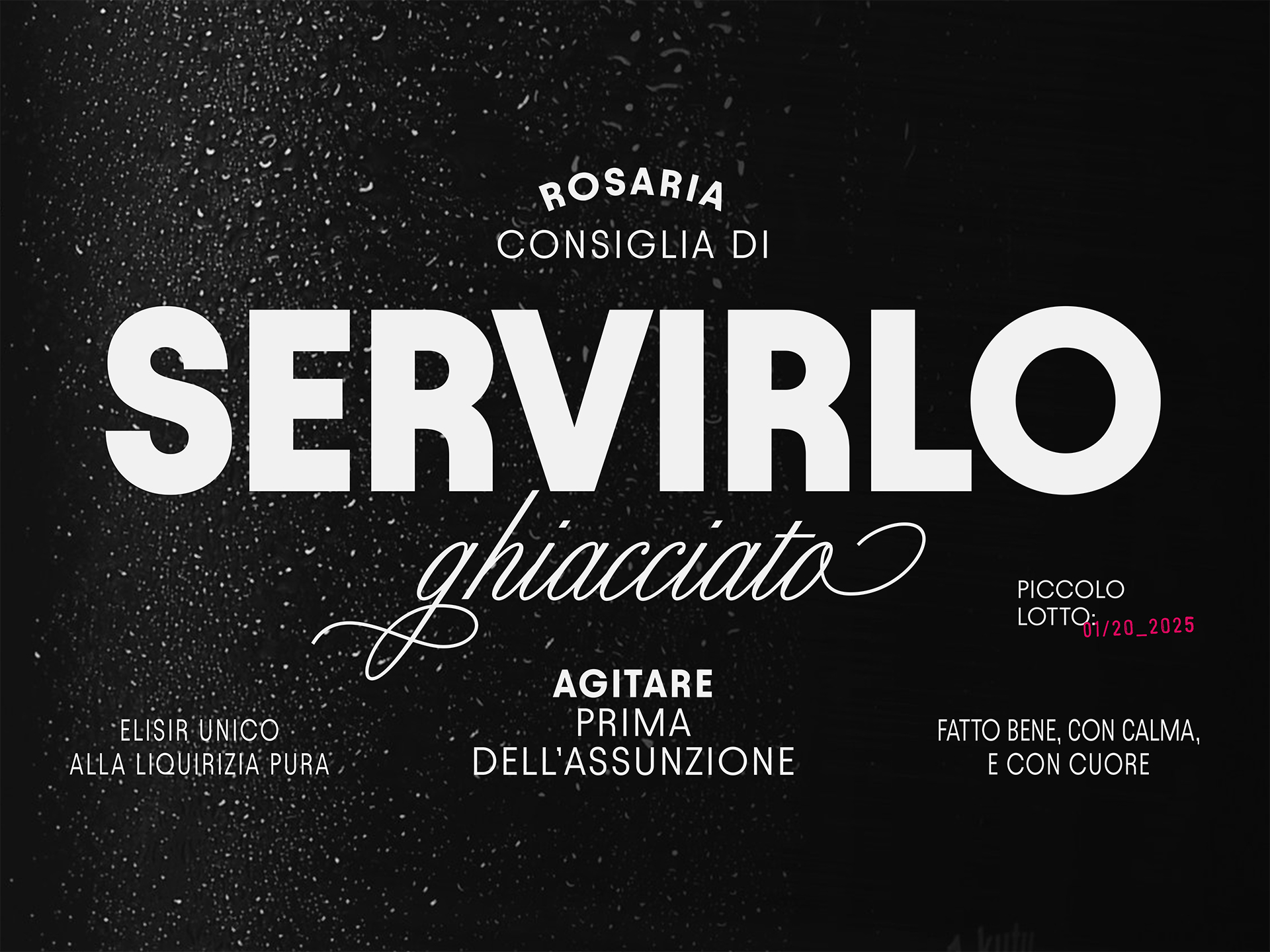
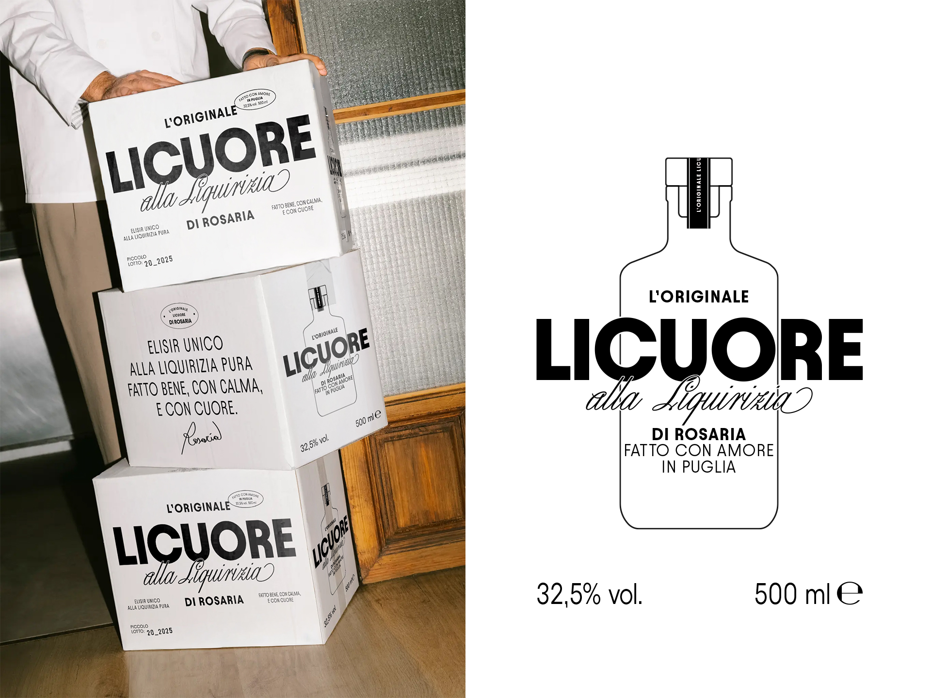
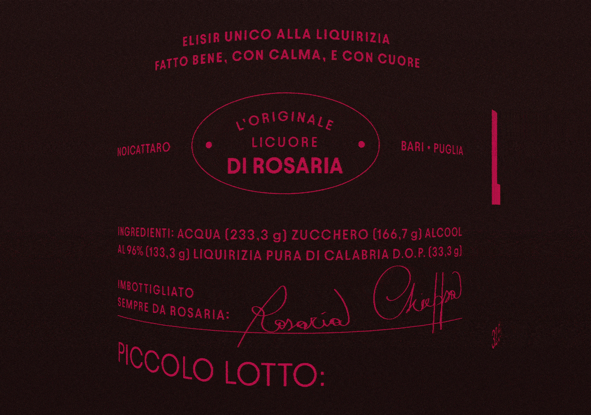
LICUORE DI ROSARIA
Rosaria’s Liquorice Liqueur is a project born from the warmth of a family recipe and shaped through a packaging design that tells its story, authentic, bold, and heartfelt.
Licuore reinterprets the visual language of traditional Apulian liqueurs with a contemporary touch: a deep black bottle contrasted by a vivid red. The color of passion, and of the love Rosaria pours into her homemade liquorice liqueur.
A design that blends roots and character, crafted to hold something made by hand and with heart.
Agency: MWG©
Year: 2025
︎ Identity ︎ Logo ︎ Packaging
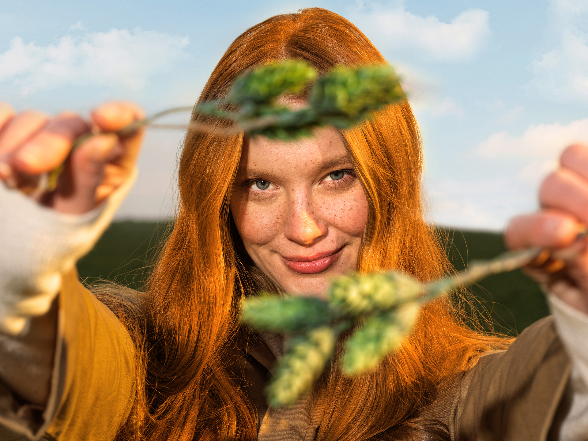
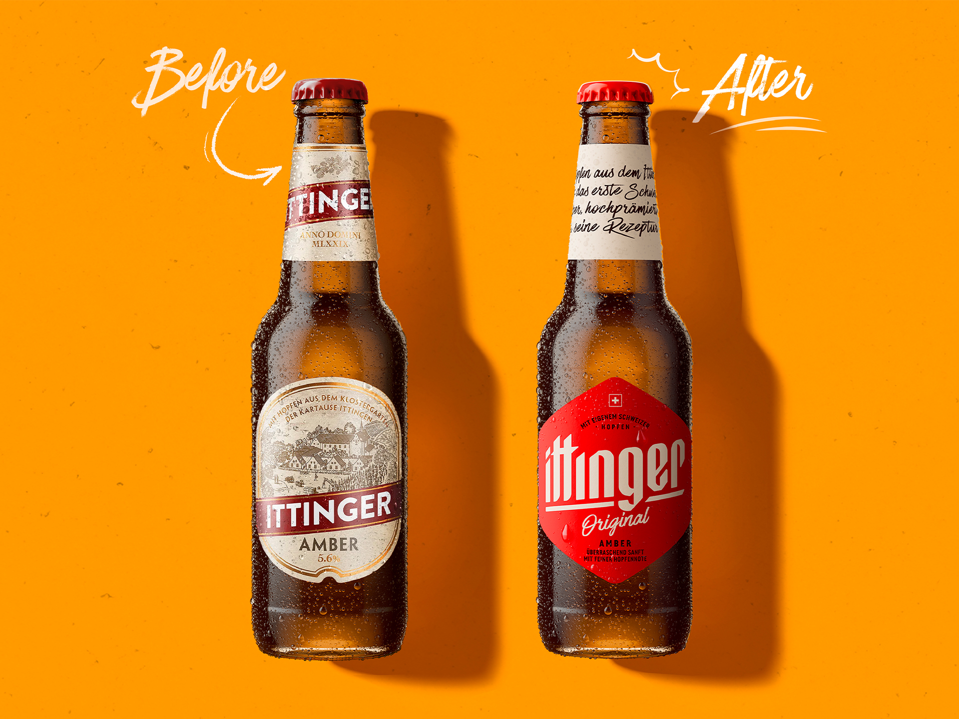
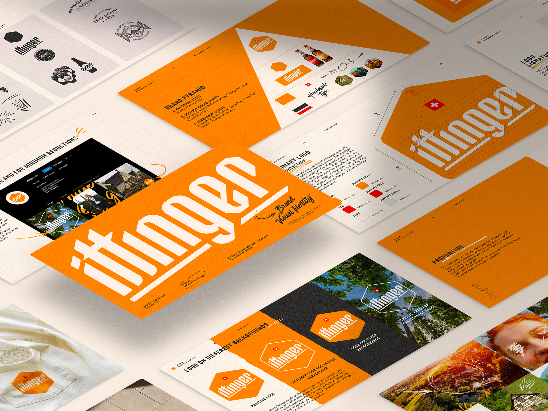
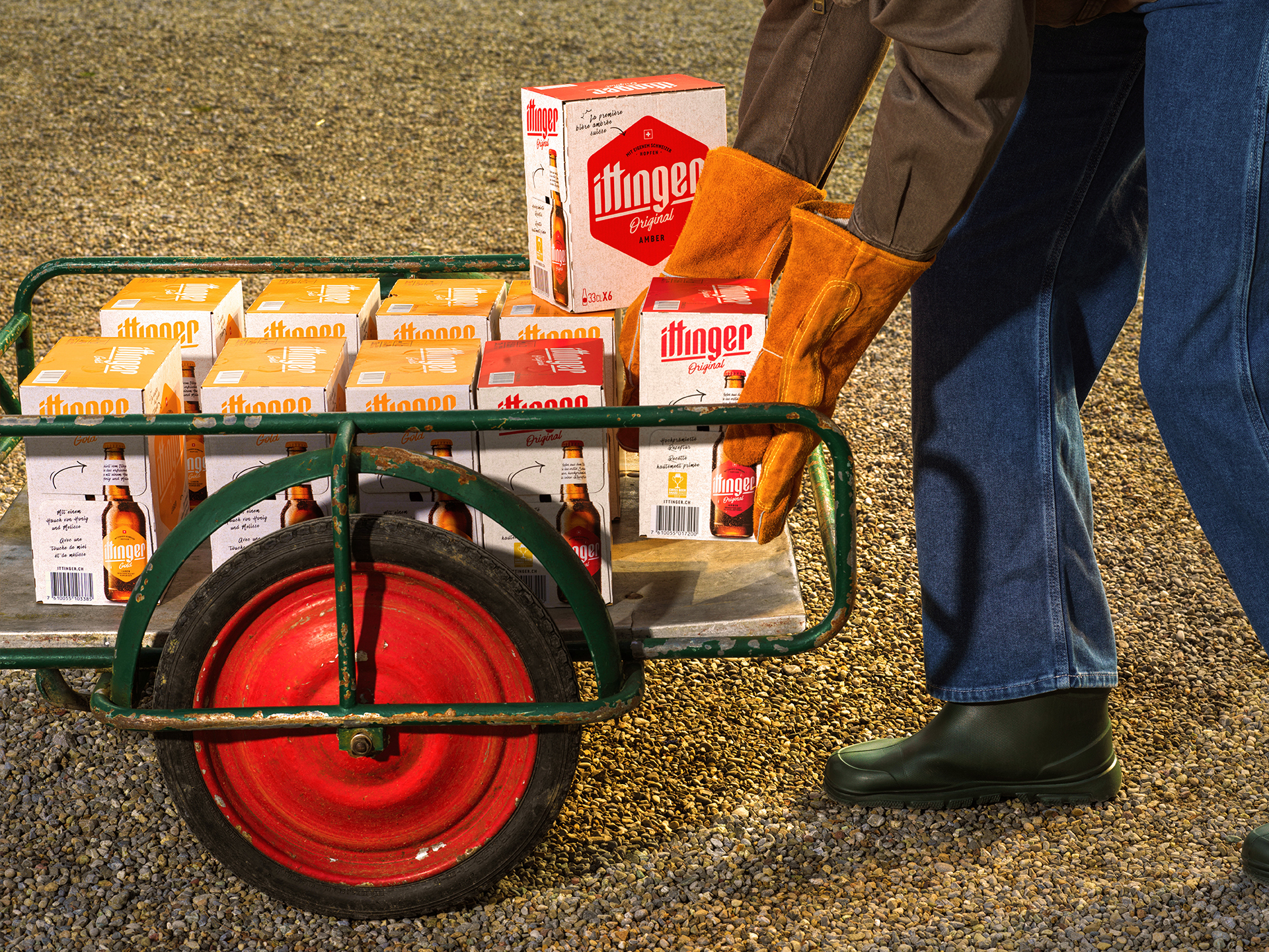
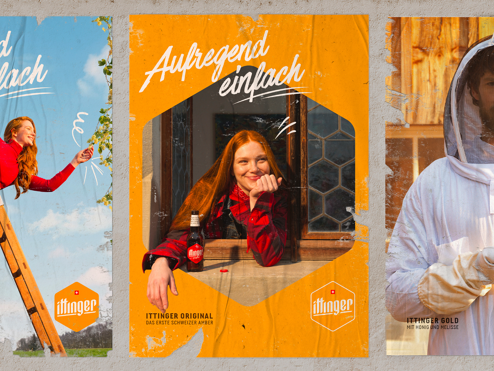
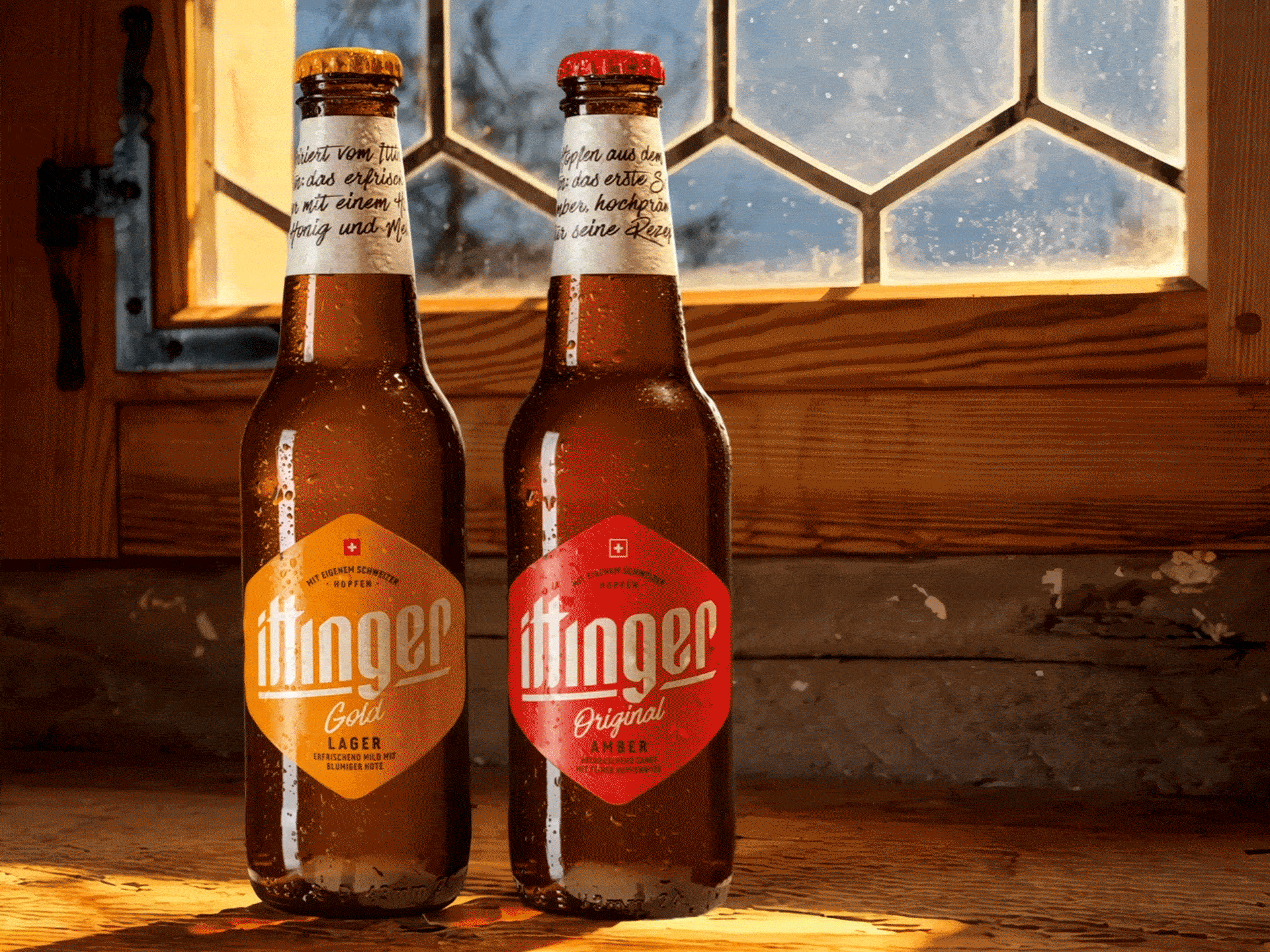
ITTINGER
For Ittinger, a historic beer brewed within the walls of Kartause Ittingen. A new visual identity and label system mark the start of a new chapter.
Hexagonal cues echo the monastery’s stained-glass windows, subtle colors define the range, and refined typography bridges past and present.
Agency: Robilant Associati
Year: 2024-2025
︎ Identity ︎ Logo ︎ Packaging


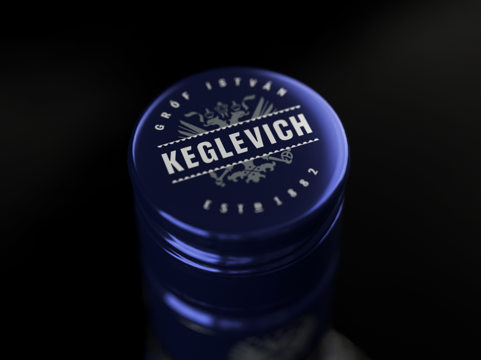
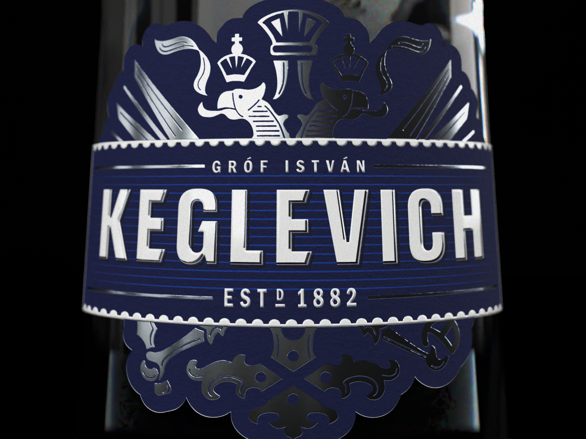
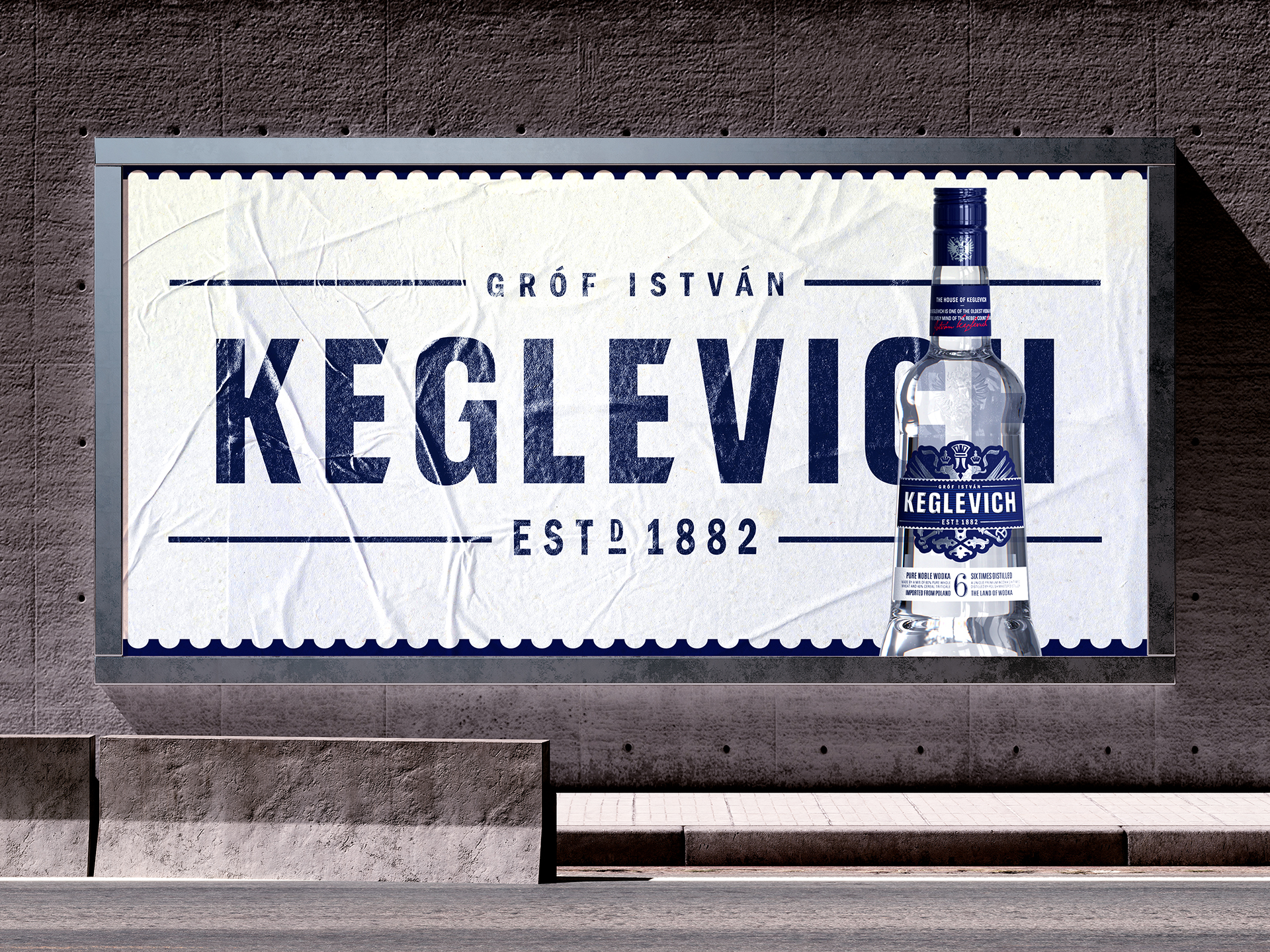
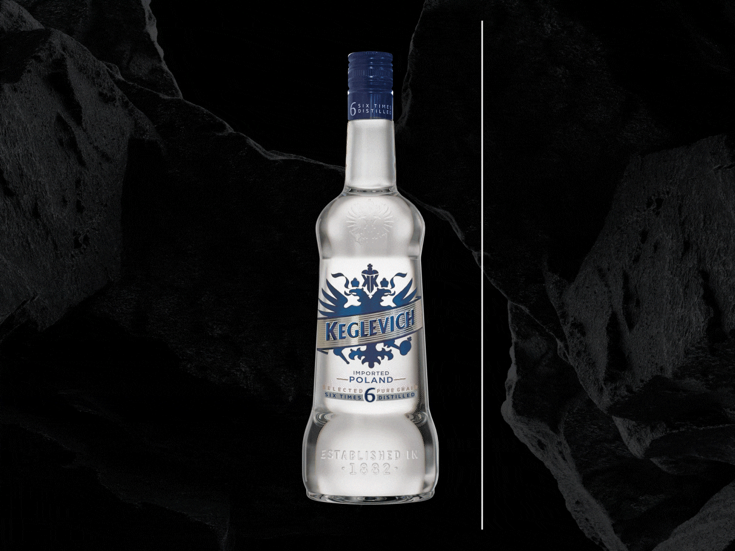
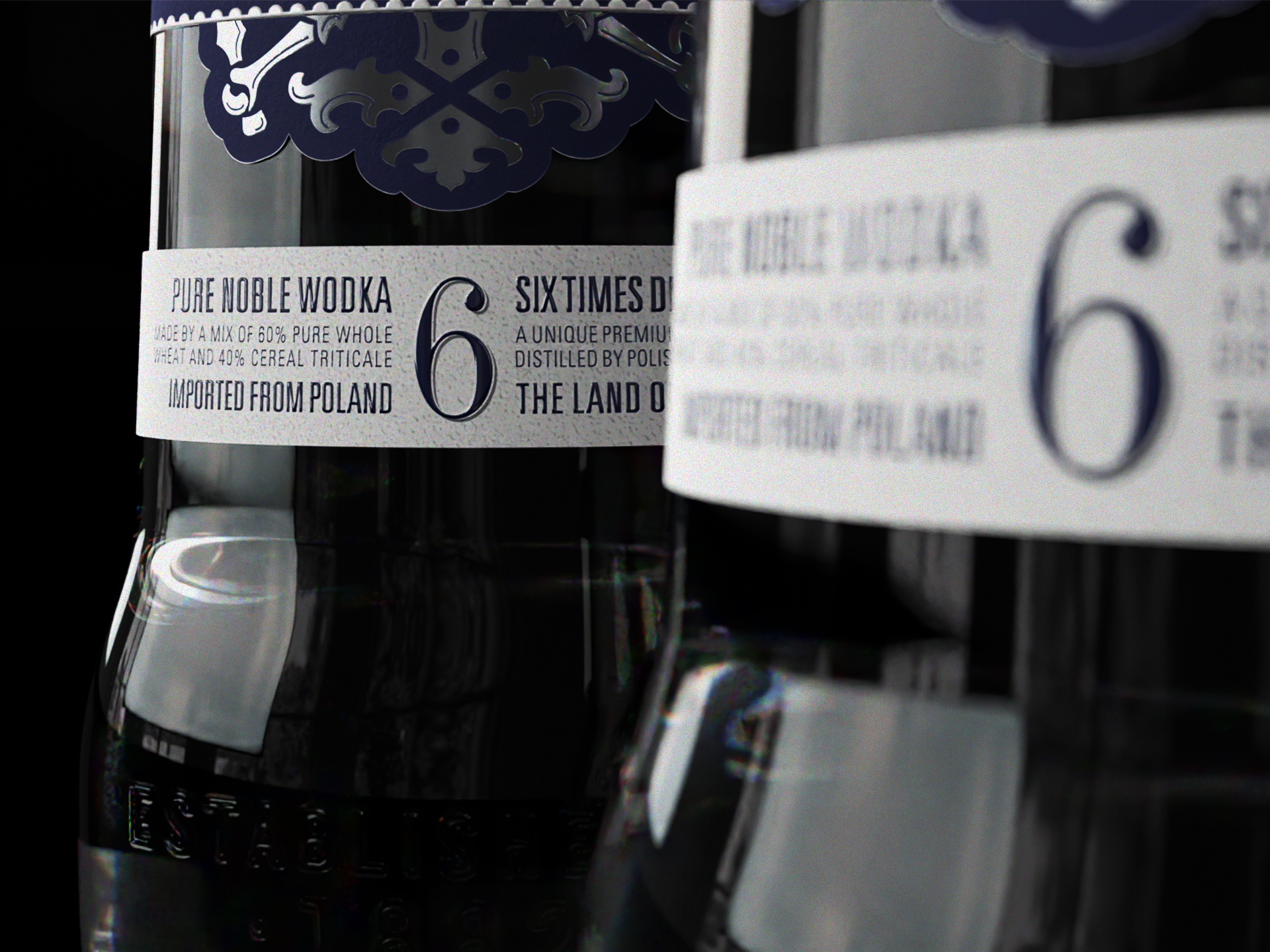
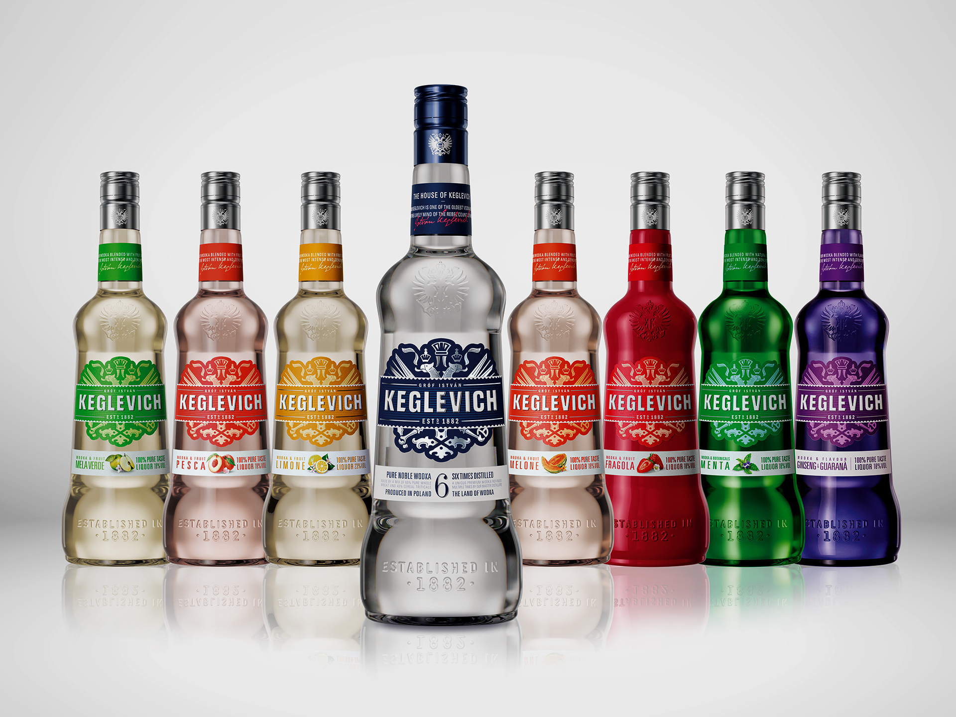
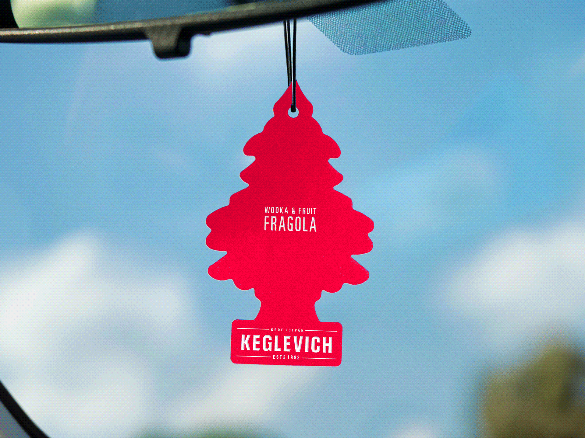
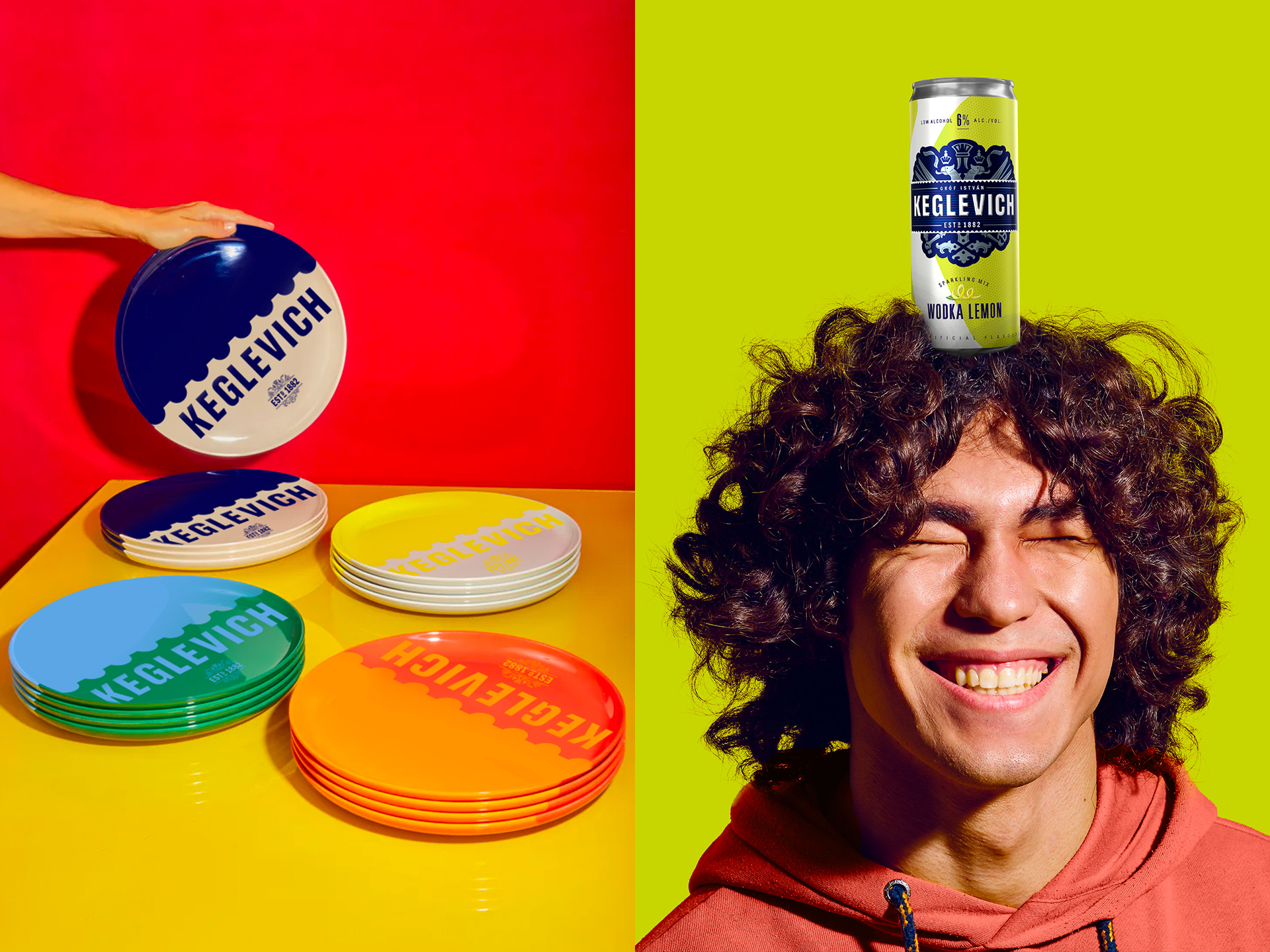
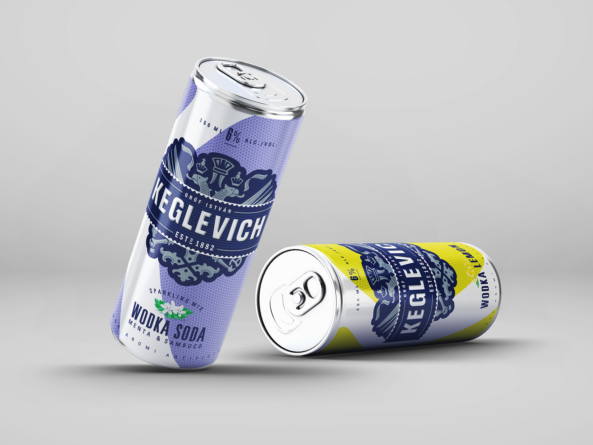
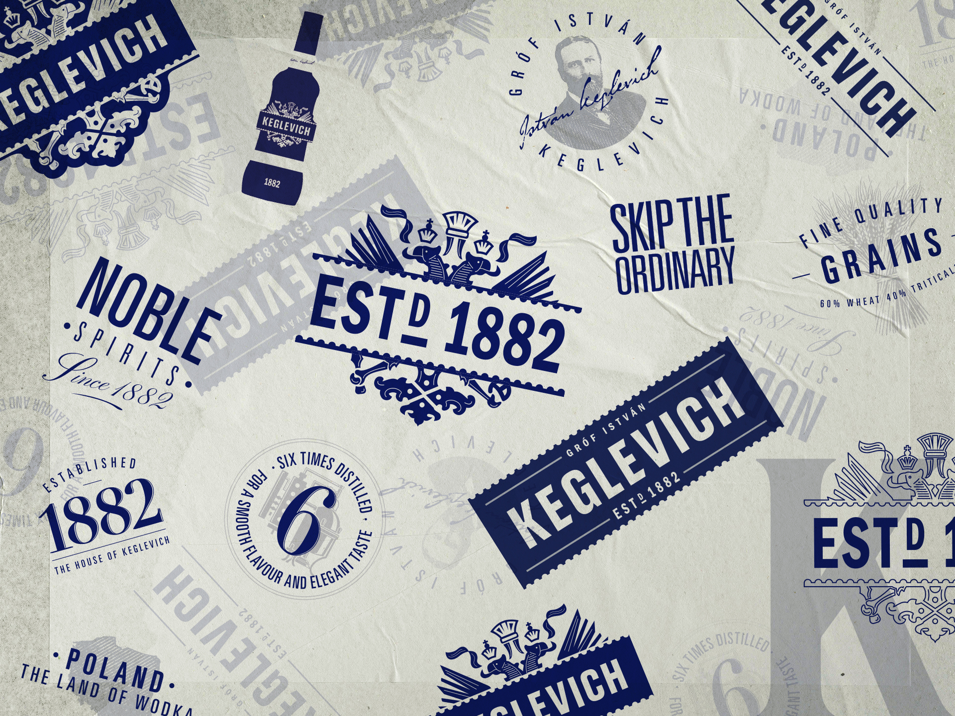
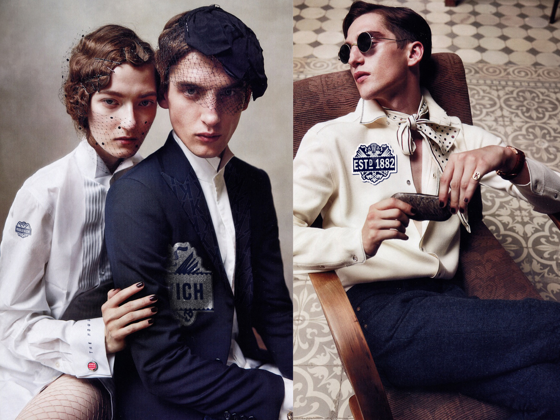
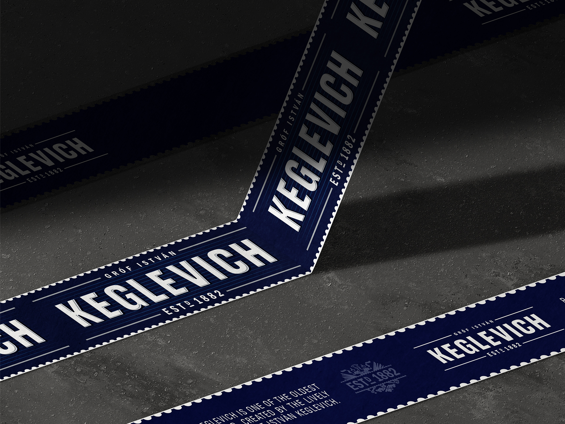
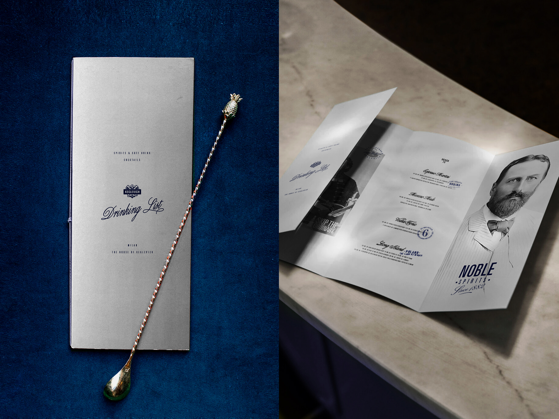
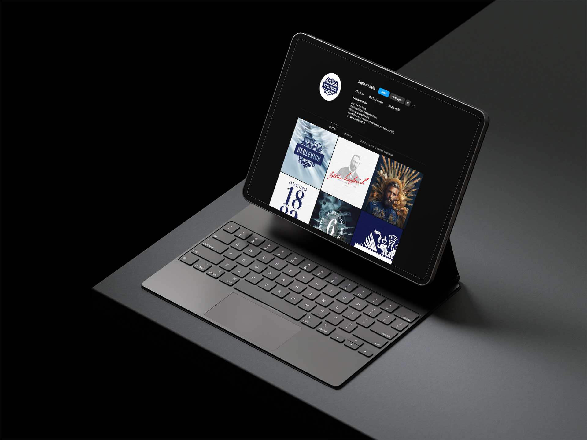
KEGLEVICH
Discovering the noblest side of Vodka.
Keglevich, one of the most historic and iconic vodka brands, enters a new era with a completely revamped look, bearing witness to its centuries-old history and established production expertise.
Agency: Robilant Associati
Year: 2023-2024
︎ Identity ︎ Logo ︎ Packaging